I have been having so much fun creating in the caravan while
away, and most I have been able to share.
This is one layout that took me about 5 days to complete and I loved
EVERY minute of creating it. I created
it as part of
Scrapfriends Janurary Sketch challenge… you can see all the
details here, but here is the sketch and what a doozie it is!
As I’m travelling at the moment on our summer holiday in the caravan, I could
only take so much stuff me when I wanted some creative down time. This along with the sketch being so detailed
really had me get my creative hat on. Here is my take on the sketch.
I don’t always create with a great deal of ‘bought’
embellishments, but a sketch like this really did call for it. I didn’t however really take much with me
other than some enamel dots and a couple of packets of chipboard elements that
were from collections that just didn’t work with these colours at all. BUT what I did take away with me was LOTS of
Spellbinders dies, cause lets face it, you can create anything armed with
these! That and the fact that I really
wanted to have more of a play with the dies being released next week at
CHA. When I saw this sketch I just knew
one of the new release dies would be perfect, and one I hadn’t had a chance to
play with yet.
A2 Modern Stationary
Approx. Measurements
1: 1⅛ x 2⅝”
2: 1⅝ x 2⅞”
3: 2⅛ x 3⅜”
4: 2⅝ x 3⅞”
5: 3⅛ x 4⅜”
6: 3⅝ x 4⅞”
7: 4⅛ x 5⅜”
This layout did come together through a long process that I
hope you will enjoy me sharing, so sit down grab a cuppa and hold on as I take
you along the journey that became the completed layout above. If you are not up for a long read and yes
WARNING WARNING WARNING lots of reading ahead, you can just look at the pics
and get an idea of the steps to create the layout, saving you lots of
time! If you are a details person and
would love a good read on about how my thought and creative process evolved, read on!
I started out with some white cardstock, I chose the Bazzill
Basics Card Shoppe paper as it is thicker and takes different mediums being
added to it well. I added some stamping
using Hero Arts Shadow inks in soft granite, teamed up with a
My Fun StampersJourney stamp ‘Chevron trail’ for the pattern in the background. Gee I
love this stamp! I then added some Pan
Pastels in Ultra Marine in an ombre effect from left to right of the page,
adding in a little white to the right side.
I love how you can build up the intensity of PanPastels but just as
easily drop the colour off as well.
Next was the black line of twine. I just LOVE my Art Deco Gloss Enamel paints
as they seem to dry quicker and leave sheen.
I don’t have all my paints with me, but these were a must! I dipped some twine into the paint, ensured
it was coated and then pulled it out. I
then added it to the layout guiding it where I wanted my line to go (obviously
as per the sketch).
To build on the background I wanted to add some colour that
was going to be a bit of a contrast to the layout colours and chose red. I delved into my set of Faber Castell Gelatos
and found the perfect colour which was just bright enough. I mixed it into some water and using the
dropper I sucked up all the colour and deposited onto my layout. I also added some round circles by dipping casing
for the dropper which holds all the liquid into the watery gelato mix and
stamping onto the layout.
At this stage I wish I had filmed it as I really loved where it was going – but
it was created in the caravan mostly at night, so that was going to be hard!
Still so much more to do so I carried on.
I added some stamped butterflies in Hero Arts ‘Unicorn’
which is a white colour to the layout, along with some black wire fence
stamping in black, all trying to work in with the sketch.
Next was embellishing the page. What could I do with pretty much only dies to
work with…..
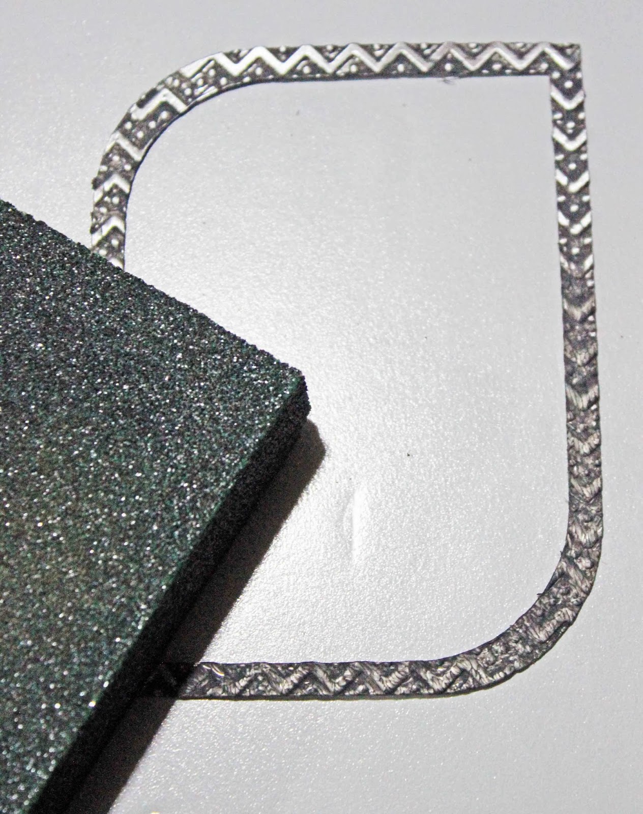
I started by nesting and cutting the new A2 Modern
Stationary dies (#4, #5 & #6 – dies numbered small to large) out of some
Spellbinders Aluminium sheets. I then
embossed them using Spellbinders ‘So
Trendy’ and ‘Harlequin’ M-Bossibility folders.
I wanted to tone down the silver colour a little so painted them all
with black Art Deco Gloss Enamel paint, allowed it to dry and then sanded them
to reveal the pattern a little more strongly.
I wanted to accent one of the frames on each side of the layout and so
added some blue paint to the top frame on each side. To finish them a little more I took a black
marker to the edge of each of the frames.
I felt it really helped to give them a little more individuality on the
layout. I just love how this die works
on the page, bit more fun than a plain rectangle frame.
I distressed some hessian/Burlap and added that to the layout
with the frames.
Next
I worked at creating the additional embellishments for the layout. I cut out many many circles I think about 15
in all from Spellbinders Standard Circles large and small nested together to
achieve a fine circle line. I did these
in white and black cardstock to help them stand out a little more for the ones
that were sitting on the blue background area.
Before adhering them together I added some white lines over the black
cardstock to give the effect of even more circles stacked on top of each other
randomly. I was so pleased with how they
came. I stamped the ‘hello’ word from an
Amy Tangerine AC stamp set to a black circle with VersaMark ink and added some
white PanPastels over the top for a chalk effect. I then added it to the back of the main
circle feature, and finished it off with some My Mind’s Eye Enamel dots.

I was really enjoying the industrial feel to the layout, but wanted to add a
bit of a natural feel to it too. I was a
bit sad that I didn’t have any chipboard with me as I thought that would have
been perfect… so I got my creative hat on again and though, why not die cut
some cogs out of wood pattern paper! I thought
of changing up a little from the sketch here, but with the industrial feel I
had going on I knew the cogs were perfect, so I stuck with them and used
Spellbinders Sprightly sprockets die set to create them. I also used this set for the washer type
circle, die cut it out of white cardstock and added some grey PanPastel to
colour it up and cut the gears off from the outside of it to form the circle. I
always emboss with my dies as it really finishes them off, in this case it
meant lots more accent as the PanPastels really picked up all the detail.

So then onto my next challenge the circle with the lines in
it and a button. I loved the contrast of
the lines on this circle and although I could have gone with anything else
here, I wanted to include it. I therefore
adhered a square piece of hessian/Burlap to some clear plastic. While the glue was still wet, I pulled out
one by one the all the fibers going one way leaving a series of lines. I then cut this into a circle. I decided to ink up the burlap lines with
some black ink. Although I did have a
couple of buttons left over from a kit I took away with me, I decided to add
some enamel dots to balance with the ones I added in the ‘hello’ circle I
created earlier.

I also noticed the stitching lines in the sketch, for this I
decided on some barbed wire, again to go with the industrial feel. The only thing is I didn’t have any chipboard
barbed wire either… given we are travelling in the outback I could probably
have found some REAL barbed wire, but I remembered a BoBunny stamp set that I
had packed. I stamped with some Black StazOn
on some plastic from used stickers and then fussy cut them out. They were really easy to add to the layout in
this form which also kept their fine lines more authentic.

I finished off the layout with a bit of chevron washi tape as
per the sketch near the photo, as well as my title cut out of Spellbinders Font
One Uppercase alphabet set and Red Bazzill cardstock. I also added some Fancy Pants chevron paper the
‘treasure’ word and the arrow frame at the bottom right of the photo cut from
some Teresa Collins paper. The last
little addition was the hearts stamped from the Amy Tan AC stamp set used
earlier and fussy cut out before adding them to the layout.
If you are still reading at this point I applaud you lol… it
was a journey and a half creating this layout and I felt although I have never
done such a post, I felt I wanted to share.
I know it would have been MUCH easier to portray this in a video, but
given I created this in the caravan, at least there is some step by step
pics! Here are more detail pics I took to give you a better feel for all the embellishments created.
To reward you for getting near the end of this epic post… I thought I would
share another card I created using another of the new dies released yesterday.
This card was much easier to put together with most of the work being in the background piece where I blended a few different PanPastels for a soft background. I love how this card came together in a colour I don’t
normally use on cards. I am totally in
love with the new feathers dies and how they can be so effective in the simplest
form.
Approx. Measurements
1: 1⅝ x 1”
2: 1⅞ x ⅞”
3: 2 x ¾”
4: 2½ x ⅝”
5: 2⅝ x 1”
6: 3½ x ⅞”
There are more dies part of the release that were ‘outed’ yesterday as part of the
Spellbinders Sneak Peekblog give-away, and you can check out the post here to see them! Some more amazing designers for Spellbinders,
Seth, Holly and Candy have step by steps of amazing projects to share with you
on their blogs. So head on over and
check it all out. There are amazing
prizes up for grabs, so don’t forget to enter as well!
Oh and just an update Scrapbook and Papercraft expo in Melbourne where I will be teaching two classes is open WEDNESDAY 29th January at noon.
Thanks for hanging around and I’ll try and get another post
up real soon! Sure to be much shorter too xxx


 Here are some detail pics of the shoe:
 There was just so many details I thought a collage would be perfect. You


.jpg)


.jpg)


